Use Cases of the Five-Colour Palette
You will likely need to put together a colour scheme for your whole home if you have bought a new house, are designing a self-build house, or are planning on doing a complete home makeover. As part of this, you will need to choose a palette i.e. a select number of colours that you will use in varying amounts to achieve a cohesive look throughout your home.
What are the Benefits of Creating a Five-Colour Palette?
With so many colours to choose from, designing a whole house can quickly start to feel overwhelming. However, investing time into creating a colour palette at the outset can help to simplify and accelerate your home design journey.
Referring to a pre-made colour palette takes a lot of stress and indecisiveness out of the design process. Your colour palette will serve as a handy go-to guide for choosing any furniture or décor; allowing you to eliminate any guesswork and quickly narrow down seemingly endless options. This means that you will save can save money, time, and headaches by choosing the correct items the first time.
What’s more, limiting your colours to a select few will help you achieve greater cohesion and flow throughout the home. With five colours to mix and match, you can strike the balance between too much and too little colour throughout the home.
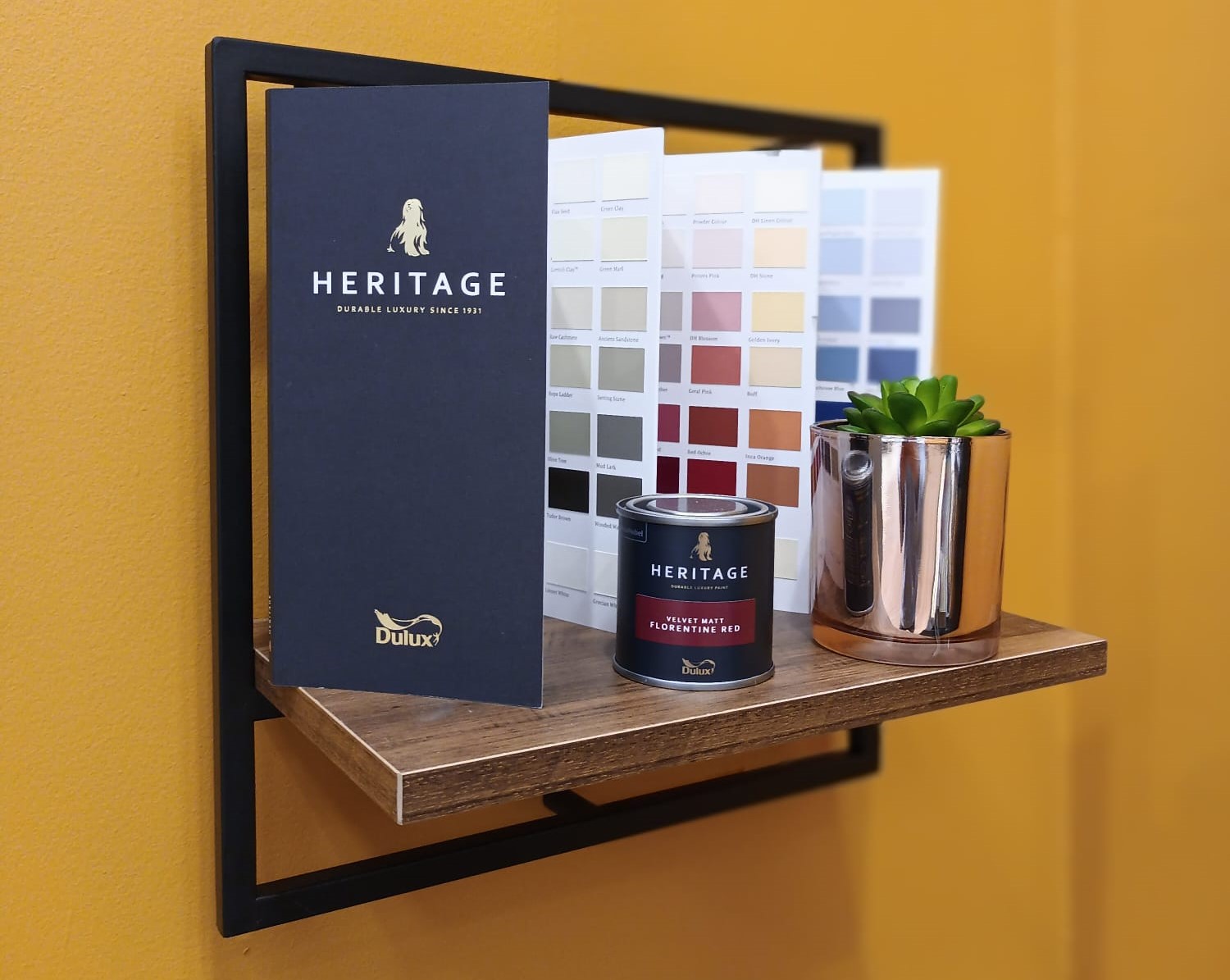
How the Dulux Heritage Colour Card Can Help You
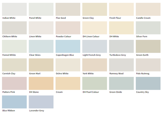
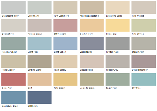
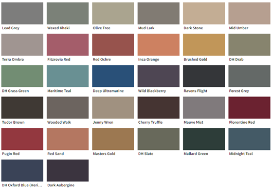
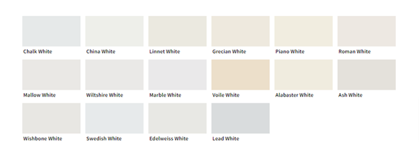
The Dulux Heritage colour card is designed in a way that facilitates the quick and easy creation of a five-colour palette. The card features 100+ colours which have been neatly organised into tonal columns, with each column paired with a complementary white. The columns go from grey shades on the far left, through to the middle neutral section, and then to the more colourful shades on the far right. The Dulux Heritage colour card is broken down into three main categories:
Pale Tones
These are muted, pale colours that will bring a light and airy feel to any space. Offering just a hint of colour, pale tones are ideal for gently lifting ceilings and woodwork.
Mid Tones
These softer, mid-tones will inject warmth and cosiness into any room. You can pair these with whites or pale tones for a softer, seamless look on your walls and woodwork.
Deep Tones
These statement colours can be used to make an impact when painted across your walls, or to enhance a focal point when balanced with a subtle white.
Complementary Whites
These whites have been carefully chosen to coordinate seamlessly with the other tones in the same column of colour.
Understanding the 5-Colour Palette
Step 1: Choose A Neutral from the Pale Tones
Step 2: Choose A Neutral from Mid-Tones
Step 3: Choose A Colour (Warm/Cool)
Step 4: Choose Another Colour from the Inspiration Item
Step 5: Choose A Matching White
Sample Five-Colour Palettes from the Pat McDonnell Paints Colour Consultant Team
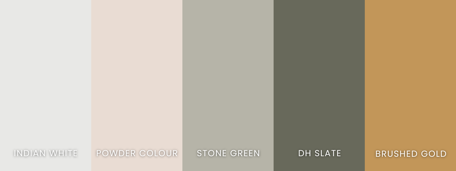
Sample Palette #1
This five-colour palette was put together by Andrea Deac, the colour consultant at Pat McDonnell Paints in Nutgrove, Dublin. She suggests unifying the whole house by painting Indian White on all the trim. Powder Colour could potentially be used to bring a splash of colour to the kitchen units. Stone Green could also be used on trim or doors alongside DH Slate. She also puts forward using Brushed Gold as a luxurious front door colour.
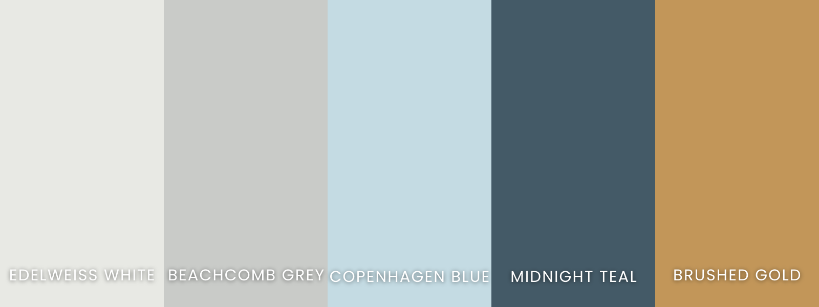
Sample Palette #2
This seaside-inspired palette was created by Anne Curtin, the colour consultant at Pat McDonnell Paints in Galway. She suggests unifying the whole house by painting Edelweiss White on the trim and doors. For a neutral wall colour, she has opted for Beachcomb Grey. She recommends using Copenhagen Blue to inject a bit of colour - perhaps on kitchen units and bathroom panelling. Anne complements this with Midnight Teal which could be used on a kitchen island and/or as a living room colour. For feature walls, she recommends Brushed Gold.
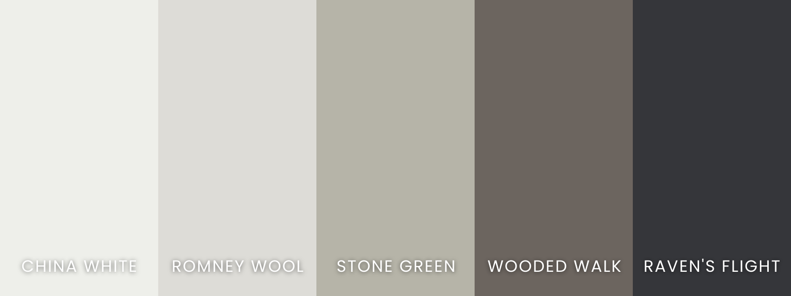
Sample Palette #3
For her palette, Fiona Finnegan, the colour consultant in our Centre Park Road branch, took inspiration from the natural world. She starts with China White as a unifying colour that can be used on trim and ceilings. For a neutral wall colour, she has chosen Romney Wool which can then be accented with Wooded Walk. She pairs this with Stone Green which could be used as a soft wall colour in the bedroom and bathroom. As an additional feature colour, she recommends Raven's Flight which will add a touch of drama to any space.
About Dulux Heritage
The Dulux Heritage Collection brings a timeless luxury colour palette that meets the demands of busy, modern life. Heritage consists of 112 luxurious shades which combine contemporary trends with traditional craftsmanship making every space feel extraordinary. These durable shades have been specially curated to blend classic colours from the past with contemporary trends to bring timeless style to every home.