Co-created by Farrow & Ball’s colour curator Joa Studholme and Head of Creative, Charlotte Crosby, the careful selection process took into account the impact of the pandemic on our relationship to colour. Commenting on the new additions, Studholme said:
“Our relationship with our home has changed so much over the last few years, it felt like the perfect time to introduce these new colours.”
With the new colours, Farrow & Ball will round out their existing palette with new shades that are more in line with current design preferences. Longevity was a key selection criterion; resulting in new colours that feel timely without being trendy.

Exploring the 11 New Colours
Stirabout No. 300
This lovely neutral colour takes its name from Irish Stirabout porridge. With just a hint of underlying grey, this warm neutral off-white is an ideal choice for those seeking to strike a balance between airiness and cosiness. For a harmonious feel, try pairing Stirabout with Jitney or Dead Salmon.

Eddy No. 301
Eddy is a gentle green colour that sits at the lightest end of the French Gray and Treron family. This delicate colour invokes the natural world and is an ideal choice for calm, relaxing spaces.
Embrace emeralds by pairing Eddy with a darker green colour such as Beverly.

Tailor Tack No. 302
A blend of beige and pastel tones, Tailor Tack is the most delicate pink in the Farrow & Ball collection. Perfectly paired with vintage finds or industrial accents, this shade works well in traditional and modern schemes.

Templeton Pink No. 303
Templeton Pink was developed for the dining room at Templeton House, it suits a contemporary setting just as well. A more intense version of the Farrow & Ball classics Setting Plaster or Pink Ground, Templeton Pink creates a warm, welcoming space, particularly in low light where this shade becomes surprisingly deep.

Bamboozle No. 304
A spirited red with a fiery hue, Bamboozle brings joy and warmth to any room scheme. This warm red will go beautifully with a chalky off-white such as Slipper Satin. For a dramatic and moody effect, pair with other intense colours such as Beverly and Wine Dark.

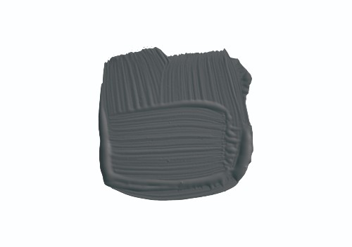
Hopper Head No. 305
Hopper Head is a moody charcoal colour that is a more intense version of the ever-popular Railings No. 31. We think this colour pairs beautifully with Sulking Room Pink or Selvedge.
Selvedge No. 306
Selvedge offers the perfect meeting point between blue and grey. As such, it is an ideal option for those who are seeking a blue colour that isn’t overly dramatic. It pairs well with accents of darker colours like Inchyra Blue or Hopper Head.

Kittiwake No. 307
In homage to its seabird namesake, Kittiwake is a cool blue colour that evokes the bright hues of the sea on a sunny day. Kittiwake features a little bit of black pigment that ensures a fresh and modern feel. A sophisticated blue, it looks fantastic with Wine Dark and Borrowed Light. It also complements stainless steel especially well, so is ideal for contemporary kitchens.

Wine Dark No. 308
Wine Dark is inspired by midnight skies. Farrow & Ball’s richest blue, the glamourous Wine Dark becomes even richer in low light, making it ideal for intimate, candlelit spaces.

Whirlybird No. 309
Whirlybird is a lighter, mid-point green that is ideal for brightening up dark spaces. We like how this looks with Middleton Pink and James White.

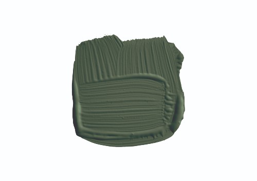
Beverly No. 310
A stunning forest green, Beverly is a dependable, uncomplicated colour. One for the biophiles, this colour appears even greener in bright daylight or more conservative in lower light. Balance it out with Stirabout or go all in with Calke Green.
Who is Farrow & Ball?
Established in 1946 in Dorset, Farrow & Ball is a premium paint brand known for its rich shades and exceptionally high-quality finish. Farrow & Ball leverages traditional techniques in its manufacturing process in order to bring out the best in its ingredients. This combination of heritage and quality ensures a range of paints of unparalleled depth and complexity that have the power to transform modern and traditional spaces alike.

You can browse the full range of Farrow & Ball paints in-store and online at Pat McDonnell Paints.