Read our guide to discover stylish ideas and inspiration on how to use an autumn colour palette in your home.
As we settle into the longer evenings and colder weather of Autumn, now is the ideal time to cuddle up and get cosy in warm and moody interiors. When the season hits, is there anything better than snuggling up in front of the fireplace with a good book and a steaming, hot drink?
In this guide, we will show you how to use colour to create a perfect Autumn haven that is both snug and serene. We asked our in-house colour experts to weigh in on their favourite Autumn colours and create seasonal schemes.
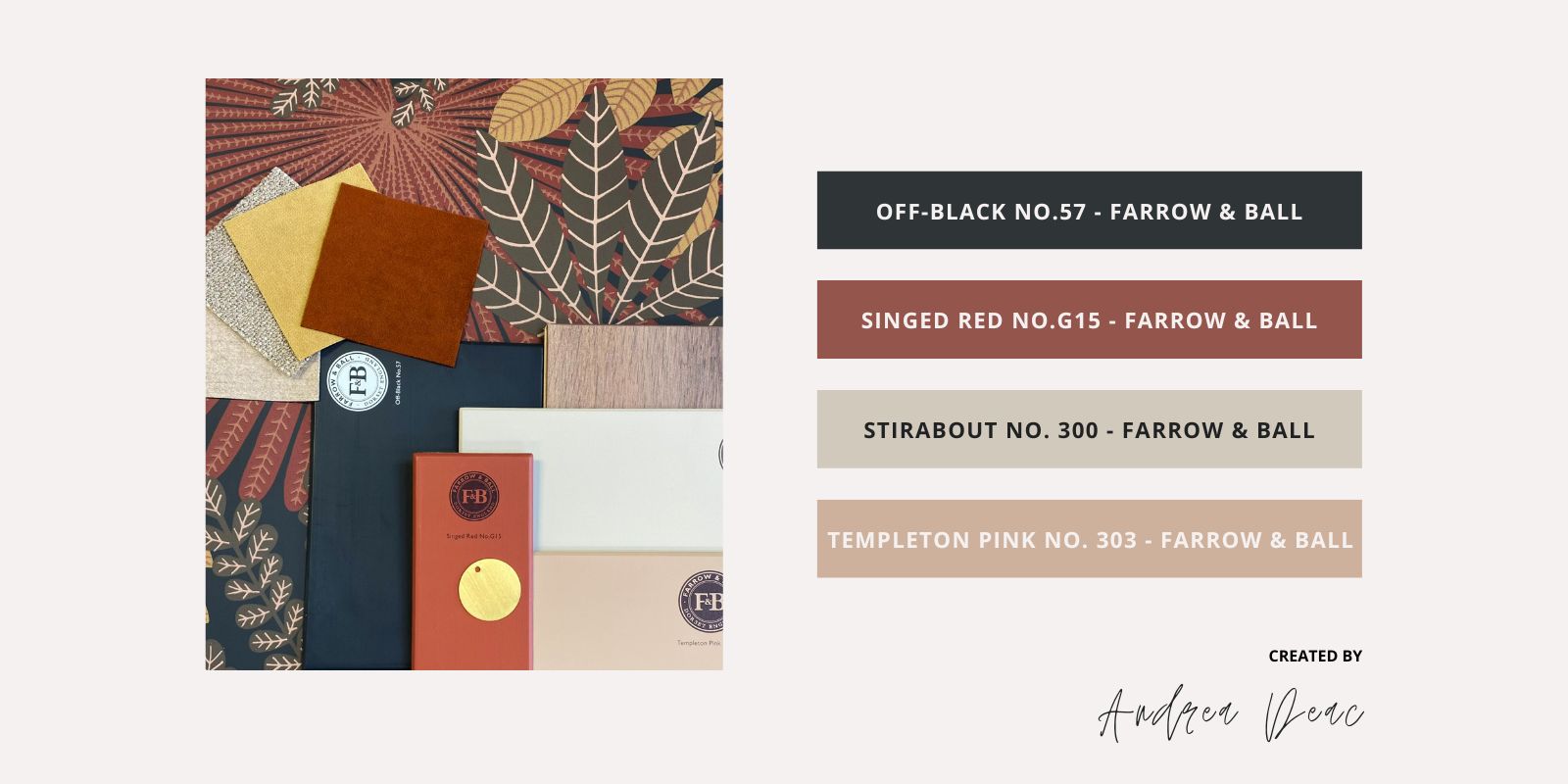
Andrea Deac is a member of our Colour Consultation team in our Dublin store. For her palettes, she balanced out the rich dark tones that are so linked with the darker Autumn months with fresh, warm neutrals for a glamourous effect. Her first palette is made up entirely of Farrow & Ball colours which are universally loved for their beautiful richness and depth of hue.
🎨 Off-Black No.57 - Farrow & Ball
🎨 Singed Red No.G15 - Farrow & Ball
🎨 Stirabout No. 300 - Farrow & Ball
🎨 Templeton Pink No. 303 - Farrow & Ball
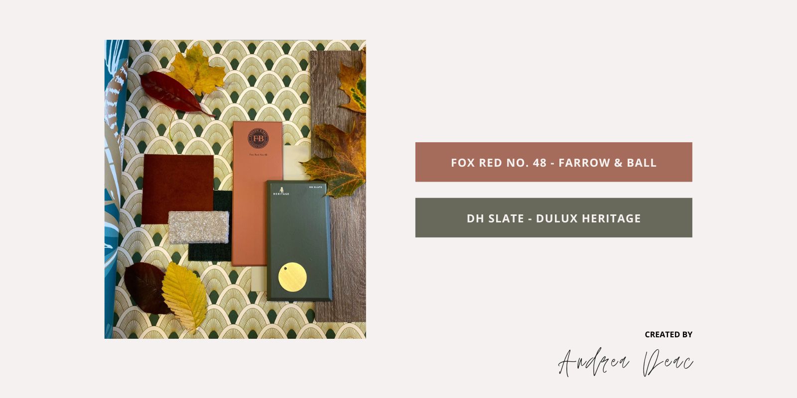
For her second palette, Andrea took inspiration from the colourful autumn foliage. She tells us, “I took all the inspiration from morning walks through the park. All the burnt oranges, golds and dark greens were so beautiful! I even picked up some to put together in a scheme.” When it comes to accessories, she recommends lush, velvet textures to add that extra layer of warmth and cosiness.
🎨 Fox Red No. 48 - Farrow & Ball
🎨 DH Slate - Dulux Heritage
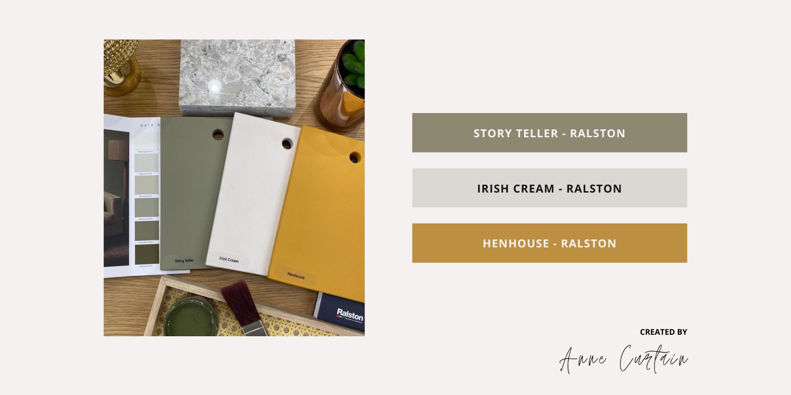
Anne Curtin from our Galway team also put together two seasonal schemes. For her first palette, she takes inspiration from the muddy greens and earthy ochres that are so characteristic of this time of year. She writes, “For that beautiful country interior, try Ralston Story Teller, a timeless dark earthy green for kitchen units, surrounded with Ralston Irish Cream, a warm white for the walls, together with a pop of our signature colour Henhouse, to bring that perfect Autumn story to your home.”
🎨 Story Teller - Ralston
🎨 Irish Cream - Ralston
🎨 Henhouse - Ralston
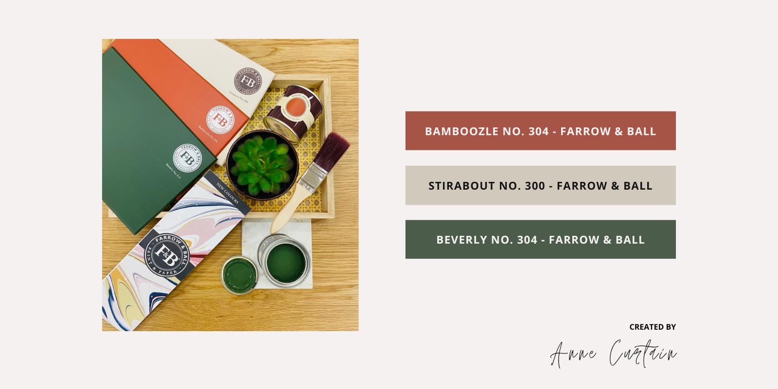
For her second palette, Anne paired together some of the recently released colours from Farrow & Ball for a stylish look that invokes the changing leaves. As she explains, “Inspired by nature and Autumn leaves 🍁 why not enrich your home with these beautiful new Farrow & Ball new colours and allow the senses to delight in the decoration of your home.”
🎨 Stirabout No. 300 - Farrow & Ball
🎨 Bamboozle No. 304 - Farrow & Ball
🎨 Beverly No. 304 - Farrow & Ball
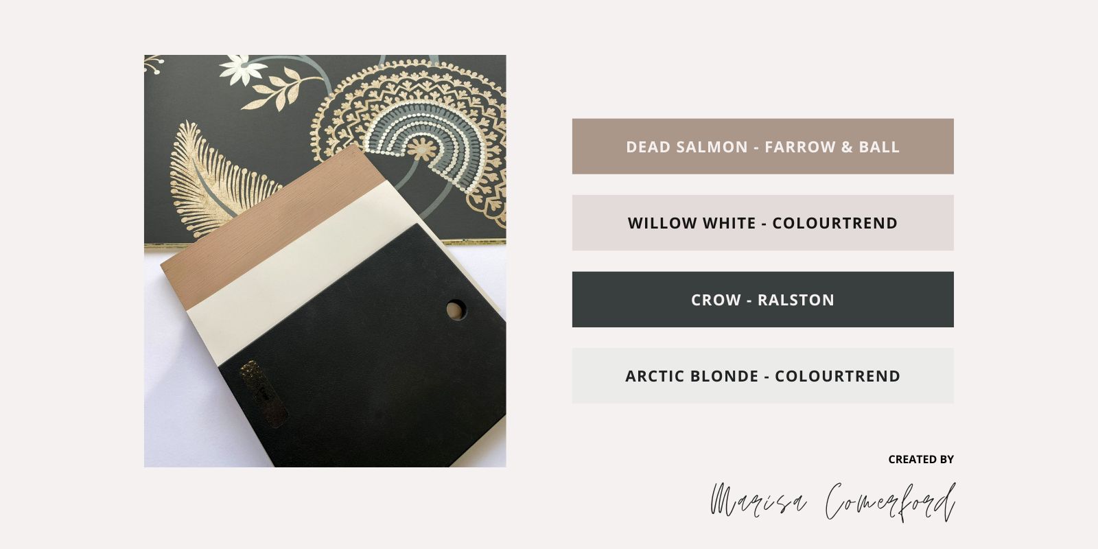
For a luxurious kitchen interior: Use Farrow & Ball Dead Salmon on an island paired with Ralston Crow on surrounding cupboards. Colourtrend Willow White on walls and Arctic Blonde for ceilings, skirtings and architraves. For a touch of decadence, add the Sanderson ‘Caspian Hakimi Ebony’ wallpaper."
🎨 Dead Salmon - Farrow & Ball
🎨 Crow - Ralston
🎨 Willow White - Colourtrend
🎨 Arctic Blonde - Colourtrend
📄 Caspian Hakimi Ebony – Sanderson
Danielle Galvin is a member of our expert colour consultation team in Dublin. For her first autumnal palette, she brought together old and new colours from Farrow & Ball. Colours used include the warm terracotta of Fox Red, the deep mustard shades of India Yellow, and the earthy neutral Stirabout. She sets these colours against the Caselio wallpaper “Green Life Joy” which features beautiful shades of rose ocre throughout.
🎨 Fox Red - Farrow & Ball
🎨 India Yellow - Farrow & Ball
🎨 Stirabout - Farrow & Ball
📄 “Green Life Joy” - Caselio

For her next colour scheme, Danielle combined warm and earthy tones from Ralston. Colours used include Tagine, Borderline and Zambezi. For a sense of classic elegance, she places these colours against the Borastapeter wallpaper “Timeless Traditions 3295” which features a pastel palette comprising of delicate pinks, greens and yellows. This palette would work perfectly with neutral flooring, fabrics in neutrals and dark greens and black metalwork.
📄 “Timeless Traditions 3295” - Borastapeter

Patricia O'Connor, the Colour Consultant in our Athlone store, designed a scheme that brings the outdoors in. For her palette, she pulled together colours that evoke the flaming reds of falling foliage, the warm golds of the forest and the fresh greens of evergreen trees.
🎨 Afterhours - Ralston
🎨 Spruce Bark - Ralston
📄 “A1291 Floral” - Amalia

If you would like to avail of our Colour Consultancy service, why not visit our dedicated page here and book your session today!
Subscribe to our Newsletter and we’ll send you the best trends, advice and ideas